Horizontal Space
February 16, 2011
Bastien’s latest post about the new GNOME screen panel—which looks generally nice by the way—reminded me of something that bugs me a bit on certain user interfaces with abundance of horizontal space.
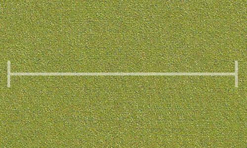
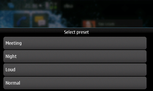
In the new screen panel case, the brightness slider widget fills most of the window width. My first impression was “Wow, I’ll have to drag the pointer quite a long distance to adjust brightness”. But this kind of misuse of horizontal space is not so rare in other contexts. You can also see it on MeeGo’s status panel with too wide buttons on top. Or in some Maemo 5 apps, with weird menu buttons filling the whole screen width.
This kind of issue usually happens when the UI has to conform with some broader constraints from the design. For example, the screen panel runs inside GNOME’s System Settings which requires all settings panels to have the same dimensions. MeeGo’s status panel could definitely be less wide but the design seems to require all panels to fill the screen width. All that for good consistency reasons. But you might end up giving more space then the UI actually needs—in which case you probably want to ensure nothing looks odd.
Bad use of horizontal space can be avoided by spending a bit more time getting your UI layout right for the available horizontal space. Adding inconsistency to better cover special cases might be acceptable—if the resulting UI doesn’t have a major negative impact on the user experience.
The examples I gave here are not the end of the world or anything. But they definitely add some unwanted awkwardness to the UI. And, you know, little details matter.