UI polishing in Firefox for Android
April 29, 2013
Last week, we did our very first topic-oriented hackathon focused on UI polishing bugs. The UI changes we’ve done will make a substantial difference in the experience of using Firefox on Android. Here are some of my favourite fixes and improvements.
Tabs
Details in the tabs UI can make a big difference UX-wise. We changed the tabs button icon (see image) to provide better affordance. The new icon also features a much cooler animation when tabs are added or removed.
Last but not least, we added a subtle parallax effect when you the open/close the tabs panel giving it a more fluid feel.
Address bar
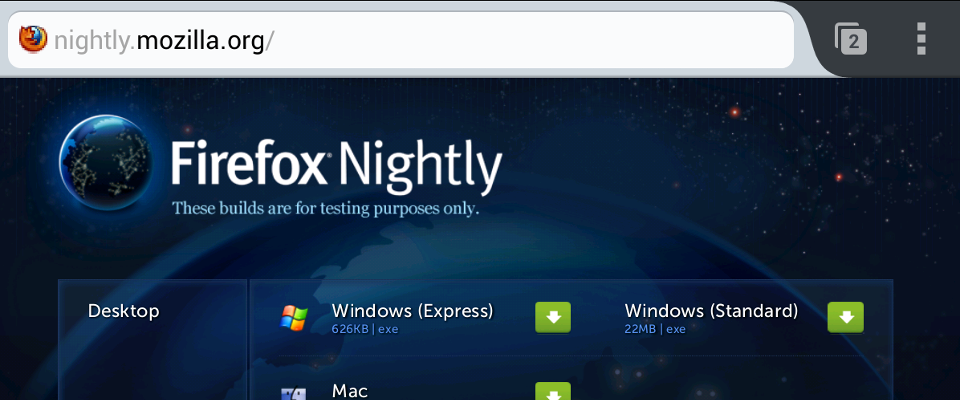
As Wes has already reported, you now have the option to show URLs instead of page titles in the address bar. The domain highlight (see image) is a nice touch and gives us feature parity with Firefox on desktop.
The reader and stop buttons now have properly sized hit areas to avoid tapping other parts of the toolbar by mistake—a long overdue issue.
That’s not all
Reader Mode will get some nice style updates for serif fonts, doorhanger notifications now have a more polished animation, text selection handles have a more consistent style, favicons in the awesomescreen will look fancier, some visual glitches in the awesomescreen and toolbar were fixed, and more.
Not all these changes are in Nightly just yet but they will show up in the next days. Firefox 23 has everything to be my favourite release ever. Download and install our Nightly build on your Android and let us know what you think.