Toolbar in The Board
October 18, 2010
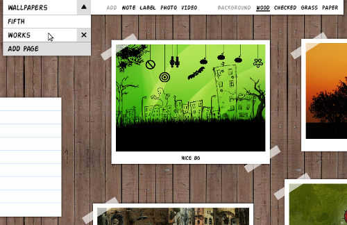
New Toolbar
You only actually validate your ideas once you start implementing them for real. This couldn’t be different with The Board. When I first started sketching the first UI prototypes for The Board I wasn’t entirely sure about the best interaction model for the use cases I had in mind. Now things are starting to become more clear.
In terms of design goals, The Board should be optimized for:
- Adding things (note, video, photo, etc) to the current page.
- Editing things (note, video, photo, etc) in the current page.
- Switching among existing pages.
- Changing the title and looks of the current page.
- Adding and removing pages.
The current expandable toolboxes—the intro video shows them in action—fail to make those tasks simple and direct because they require at least two clicks for any task: clicking to expand then clicking on desired action. Furthermore, they might be slightly unintuitive at first because they rely solely on non-conventional icons. Finally, the expanding/collapsing animations add too much movement on the screen which is a bit distracting. So, yes, the expandable toolboxes are flashy. But not so good and usable in practice.
The new The Board toolbar is an attempt to provide more direct access to some of tasks listed above. It might be more conventional than the toolboxes—which is not a problem actually—but it’s simpler, faster and more focused on the core features of the app. Right now it uses labels with no icons but that might change in the future. I won’t use icons without labels as this is generally bad usability-wise. This new toolbar is part of a wider interaction model that I’ll be implementing soon. Click on the image above to see a video demonstrating how the new toolbar works.
The new toolbar also demonstrates a new feature: the ability to name pages. I initially thought having a date-oriented list of pages would be a nice idea but that makes it hard to retrieve previously created items. Having pages with titles allow easy access to any page and induce a more topic-oriented usage—which is a nice thing.
I still have a few open questions about the new toolbar. Especially when it comes to scalability. For instance, I’m sure yet how to make it scale nicely for a bigger number of pages, things, and backgrounds. No problem. For now, I’m focused on getting a simple set of core features working well enough for dogfooding.
It would be great if I could get some constructive feedback from UI design people on the new toolbar. I also need a hand from a graphics designer to make The Board look generally prettier and more polished. Any help on those areas is welcome.