Context Toolbars in The Board
November 17, 2010
When I blogged about the new toolbar in The Board, I mentioned that it was part of wider interaction model I would be implementing soon. So, here’s the very initial implementation of what I call context toolbars in The Board. When I started thinking about how I would offer ways to customize the things you add to The Board, I had a few simple goals in mind in terms of UI.
Obvious activation. First, it should be simple and obvious to trigger context actions. I didn’t want to use right clicking or context menus as there is no nice way to make it obvious that they are available. I wanted something that would be triggered by a simple click, nothing else, as this is pretty much the first thing anyone would try.
Clarity. The UI should make it obvious what is active on screen and what are the available actions. It should make interaction context super obvious at any time. This is why when you activate, say, a label element, all other UI elements get dimmed and the only things that are highlighted in the UI are the context toolbar and the active label.
Consistency. The way the available actions are presented should be consistent among different types of elements. I thought showing an options overlay inside the elements would be a nice idea—see the “File” button shown on photos in a previous video. However, this approach has the serious limitation of not being scalable for things with different sizes—how would you show an options overlay inside a tiny text note? Context menus again are not a good choice because I wouldn’t be able to add richer UI controls to it. So, I decided that context actions would always appear in the context toolbars, always on the top corner of the window.
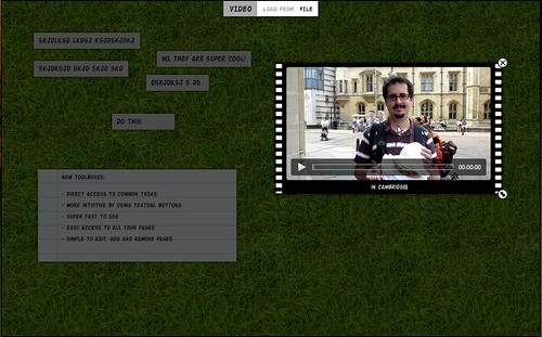
Click on the image above to see a video demonstrating the general behaviour of The Board with the context toolbars. The actual actions are not fully implement at the moment. I added just a few basic actions to be able to show off the new feature. This video also shows the use of labels, the small one-liner text elements that can be used for quick reminders.
I’d appreciate some feedback from UI people, as usual. This is of course just an initial implementation of the design. I’m open for suggestions on how the design can be improved. I’ve been hanging out in #the-board channel on irc.gnome.org. Feel free to join! First 0.1.0 release coming real soon now!
