Almost like a phone, more like a tablet
November 07, 2012
Designing apps for 7-inch devices can be a bit tricky due to the fuzzy nature of this form-factor. The Nexus 7 gave a big boost on the “small tablet” market for Android so it’s important to design your apps with these devices in mind.
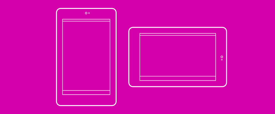
What’s is unique about the Nexus 7 form-factor is that it behaves quite differently in each orientation. Yes, the same could be said about 10-inch tablets and phones, of course. But they still generally provide a “lot of space” and “not much space”, respectively, in both landscape and portrait.
On the other hand, the Nexus 7 behaves “almost” like a phone in portrait and “more like” a tablet in landscape. Therefore, UIs for 7-inch devices will likely end up blending elements from both phone and 10-inch tablet layouts.

For example, in Pattrn, the UI for 7-inch devices blends the flat list of patterns from phones with the sidebar from 10-inch tablets when in portrait mode; while in landscape it uses the sidebar and a two-column grid, which is more like the 10-inch tablet UI. Also, on 7-inch tablets, the search entry is iconified by default in portrait and expanded by default in landscape to maintain visual balance in each orientation.

Firefox for Android is another example of this blend. Firefox’s UI for 7-inch devices adopts the more powerful toolbar with forward/back buttons from 10-inch tablets but uses the same vertical fly-in tabs tray from phones.
Designing for 7-inch tablets is about finding the perfect blend between the phone and the larger tablet UIs.